Sunday 21 October 2012

MY LATEST PAINTING IN PROGREES


DRESSING UP MY THURSDAY LEARNERS!

Last week I asked my learners to come dressed in groups of analogous colours for this week's class, with a view to selecting and arranging themselves on the theme of this term, which is creating focal points of intense colour with secondary and tertiary mixes of the same colours in the rest of the painting.

We all  got involved in the  arrangements, but it was not possible for those posing, to see the full impact of the still life they were creating of themselves, so I will have great pleasure in presenting a data projector show next week so they can all see the fruits of their labours, other than on the play back screen on my camera which I was able to show them


We worked in small groups  of analogous colours to start with, and we tried variations of background colours to see if this changed the relationship of colour balance within the group.

Colin 2 gets the best expression prize below ; )

We also looked at creating a focal point by isolating a colour borrowed from the background against the  main focal point of the group which was Colin 2 against  Colin 1, by virtue of him being the lightest colour.
I quite liked the way the sedum head was tilting towards Colin 1 and his arm created a diagonal pointing to the sedum, happy accident eh!


We had already previously agreed that Colin 1 was the dominant colour of the group. ( burgundy jumper ) And that Colin 2 stole the show by virtue of being the lightest colours amongst darks, ( pale green and checkered shorts, whey hey! Colin 2, what a star! : )


Borrowing the burgundy,  phil ( purple sedum holder )gets a prize for best facial  expression in this shot! ; )

Attempt at creating a further focal point with light, however my spotlight is very bright and not versatile enough to spot a small pool.


There was some cracking good work developing in this class, we spent the 2nd half working up our own SL's from the previous week ( Thursday class )
Colin 2 added a variety of colours in his background borrowed  from the colours of his SL but watered down, great design C 2.


Sue painted some really beautiful colours that were mixed about 50% on the paper, enough to create secondaries whilst retaining her primaries, really fluid and loose Sue : )


I could kick myself for not photographing heather's painting of this S L, ( below ) in a very short space of time she had put  down all the local values of the glass and retaining the highlights, I'm very exited to see how this develops.


At the end of the class we all went round each others work and discussed the variations and outcomes of our work, this is really useful for all to see different  approaches, and to offer supportive feedback on what worked well, and what could be improved.
This was also an opportunity for me to creep round and photograph my L's and capture interesting colour groupings as they transpired, and as a surprising bonus, some very interesting shapes also


I couldn't resist this one of Francis and Phil at Burwash cafe' afterwards, as there was a purple logo on the bonnet of the van behind the 2, I  think Phil had had enough of me taking pictures by then ; )

Francis couldn't come to the class, but I knew she'd turn up in purple anyway, so was a real asset when she came came for coffee


Next week, we'll be finishing our still life and having a go at starting an image from this week's class, even if it's just an abstract. Hmmmm.......... now there's an idea!

Wednesday 17 October 2012

CROPPING AND EDITING IMAGES ( WED WATERCOLOURS )

This lesson was about what to do with the images we recorded from Cambridge market last week.
We explored cropping and editing our pictures as part of the creative process, and we each brought along printouts of our images for group discussion, what to take out, what to leave in, what to emphasize, or de emphasize.

In cropping our pictures we are limited to what is actually there, and so we went on to draw and paint tonal and colour thumbnail  images from our reference to arrange things to better effect, but what does  that mean? and what does it involve?

Selection can be a very personal thing, but we discussed as a group what we thought looked better, or worse.

Below are a few of my images which I cropped as an example.....

The photograph below, I felt, was really 2 separate images, I thought it was quite amusing to have rufty tufty men with what appears to be chinese wallpaper behind! and I also liked the way the two men in  red, only related by their pictorial proximity, were united in the positioning of their hands, and also the man in the grey suit behind him, creating a further diagonal link to bald man.
I also thought that the group on the right, was too much superfluous distraction, but as a colour composition on it's own it had potential, with some  re jigging.


I quite liked the image below for it's counter balance of reds and black, but I found a cropped version more compelling and unified, but please feel free to disagree?
The following photo's are cropped for the same reason, let me know if you think my cropping has improved them or what you might have done differently? If you're not sure, view them upside down, so you can look at the colours and the shapes, without being distracted by the subject.


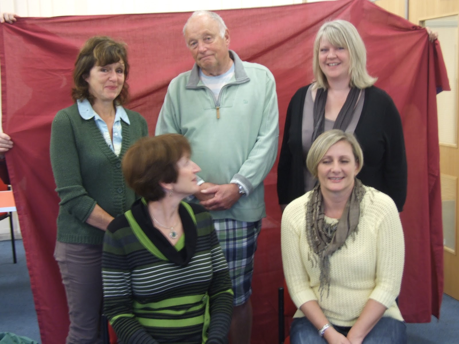
And now ladles and mentalmen! A little journey into taking the creative process a little further, here we have the 3  graces, Mel, Rosemary, and Maureen, note the cropping I did in the image below to cut out a lot of superfluous clutter, ( sorry Liz! and Rosemary 2 )


I liked the way the ladies scarves were a similar colour, and between the scarves, hands and blocks of colour behind them, the attention is drawn from bottom right, in an ark to bottom left, and I liked the way the hair of Mel and Rosemary created a point of high contrast.
Note in  the small colour thumbnail ( below ) how I have edited a lot of the crockery out of the picture, so there is just 1 cup forming a counter balance of white against Mel's coat, which I decided should also be white as a focal point, and I also kicked everything else out of the background with a ruthless swash of black, except for the orange and blue patches of  colour I thought would be useful to add a further pulling power to Mel's head.
Anyway, this part of the process is great  fun to me, although I am  aware that beginners want to just get on with the painting without doing this stage, but I do believe  that when the time comes  to sit down and just paint what is in front of you, your colour composition  glasses will be much  clearer by having practiced all  the above, and the thing you chose to draw or paint will be directed by a finer sense of what looks good, even though you might not be aware that your acquired knowledge is whispering to you!

Next week I will be showing you, beginners in particular,  how to mix and apply colours on the paper so you don't end up with streaks or a colour in-balance, and I'll be demonstrating that by adding to the unfinished picture below. In-between then, if you get  time, practice doing pencil thumbnails like the one below, about 1 inch sq, to avoid you getting distracted by subject, and focus on shapes and colours.

See y'all next week : )


Tuesday 16 October 2012

THIS WEEK'S DRAWING CLASS


This week I took my drawing class to Wicken fen nature reserve in the countryside north of Cambridge.
I wanted us to put into practice what we had learned about using proportional dividers as an instrument for scaling up objects from life.
We drew the windmill pump which proved quite tricky as those of us who were quite close to it, ( those in the howling gale outside! ) found that scaling up would not be possible, as the closeness of the windmill meant that our proportions would not fit on the page, so we measured using just one end of the dividers sight size, see previous lesson for use of dividers.
Some of the  class  stayed in the visitor center, as it was extremely windy and  quite cold, and they were far enough away to scale up the windmill using both ends of the dividers.

Below is a sketch I did, for those of you who want to finish your tonal values at home, and for ideas on detail and composition.
I would like to see your finished drawing by next week please, and for those of you who can scan and email, I'd like to put your pictures on here? : )


Thursday 11 October 2012

This week's Sawston and Comberton thursday classes


As I can't take my Sawston evening class on location, and the weather was too bad on my thursday class to go out to Cambridge market, we consolidated our understanding of this particular colour theory by choosing and arranging a still life, learner sourced, and I was every bit as much impressed at the outcome's as I was with the Marketeers on my wednesday class.

Just a re cap on last weeks classes, we were consolidating our understanding of having a focal point with a primary colour ( s ) and surrounding it with secondaries and tertiaries of the same limited pallet, which means, primarily unmixed and secondarily mixed up a bit more. 
We copied the Anders Zorn paintings above to embed these ideas in our heads before putting it into practice with our choice and arrangement of colours in our still life's this week.
This is also the exercise my beginners did at Sawston this week, where I am pleased to say I have beginners who are  lively and curious, and to that group, if you have time before next week, do a small extrt painting of the 2 women in  the above painting, and see how far and how long you can go with adding your colours without your painting getting blotchy or streaky

The photo's below are are from my Comberton class, and we started off exploring as a group each others still life contents, this was a lively and amusing discussion, which is a pleasure for me as always, and we all had fun chipping in with our ideas for arranging each others still lifes : )


Next week we will be continuing to paint up the S L's from photographs taken this week with the emphasis on creating a limited pallet of close harmony, rather that trying to copy exactly what is in front of us, so, to sum up, 
selection and arrangements of objects is a creative act, creating tonal and colour thumbnails of SL's is a creative act, and application of colour is also a creative act.

Also, next week my thursday class have arranged to come to class in groups of 3, wearing  colours of close colour harmony, with 1 dominant colour within an analogous set of 3, to be arranged as a group portrait, should be fun : )

THIS WEEKS WATERCOLOUR CLASSES


Following on from last week's classes on using a limited pallet of primary focal points, and using secondary and tertiary colours of a limited pallet to make up the rest of the scene, we went in search of these colours in real life, having copied the Zorn and Sorolla paintings last week to consolidate our understanding of this theory.

So banking on good old BBC weather, I made a preliminary trip to Cambridge market on sunday to find my own reference to email to my wednesday class, confident that on wednesday it would be fine, which happily it was.
The pictures below were just  few I emailed to my learners as an example of the type of colours we would be looking for, and whilst I didn't always find primary, secondary and tertiary in the same scene, I was able to find a strong primary virtually everywhere to adapted once back in class.


Below are a few of the photo's I took on wednesday, and I will compile all the learners photographs with a presentation  next week.
I was absolutely delighted at the imagination of my group, and the great colour ideas they were coming up with, even though some of my ladies lost focus for a short while and started to some shopping! ( I left them to it as the stall-holders were kind enough to allow us to photograph their stalls :) 


After we'd taken enough photo's of the market we went to Don Pasquali's cafe to share our photo's from our digital cameras, and to people watch, we were pointing out people wearing colours that were in harmony with the background we were focussing on, for example, opposite our cafe there was and advert in a shop window with a girl wearing a bright purple skirt, so we waited for people to walk past wearing pink, blue, or orange, and we photographed them as quickly as we could, all this was good fun, and was a vehicle for sharpening our colour perceptions and choices, and despite the photo's below showing us having a good jolly, it was very educational, and useful!

I will look forwards to giving a data projector presentation next week of 3 of each learners favorite photo's, and then well work out how to use  the images to help us build a unique painting of our own colour choices.